#Introduction

Hit the ground running with Cirrus at your own pace.

Dive into the docs.

Learn how to get started with Cirrus one step at a time.

Try it on the browser.

Try out the framework in the playground without any setup or installation.

Grab some components.

Build your project with beautifully pre-built components now.

#What is Cirrus?

Introducing Cirrus, a modular, responsive, and component centric SCSS framework aimed at bringing not only beautiful, hassle-free styling, but also a better developer experience. Almost all generated styles can be modified via its config style so you can mold the framework to whatever you want.

  • 🎁 Construct your web app or website by composing beautifully designed components.
  • 🛠 Shipped with utility classes to design with scale.
  • 📱 Fully responsive by design.
  • 🎨 Almost fully customizable styles and classes.
  • ⚡ The only file you need is the minified CSS file from a CDN.
  • 🌌 Fully open source.
VersionMIT LicenseNPM DownloadsJsDelivr Downloads

#Why Cirrus?

Here are a couple of reasons why you should consider Cirrus for your next project.

#1. Built for Rapid Prototyping

Cirrus was built to remove all the overhead associated with designing any app. The framework comes with many different classes that help you quickly construct beautiful looking components quickly without having to come up with your own design.

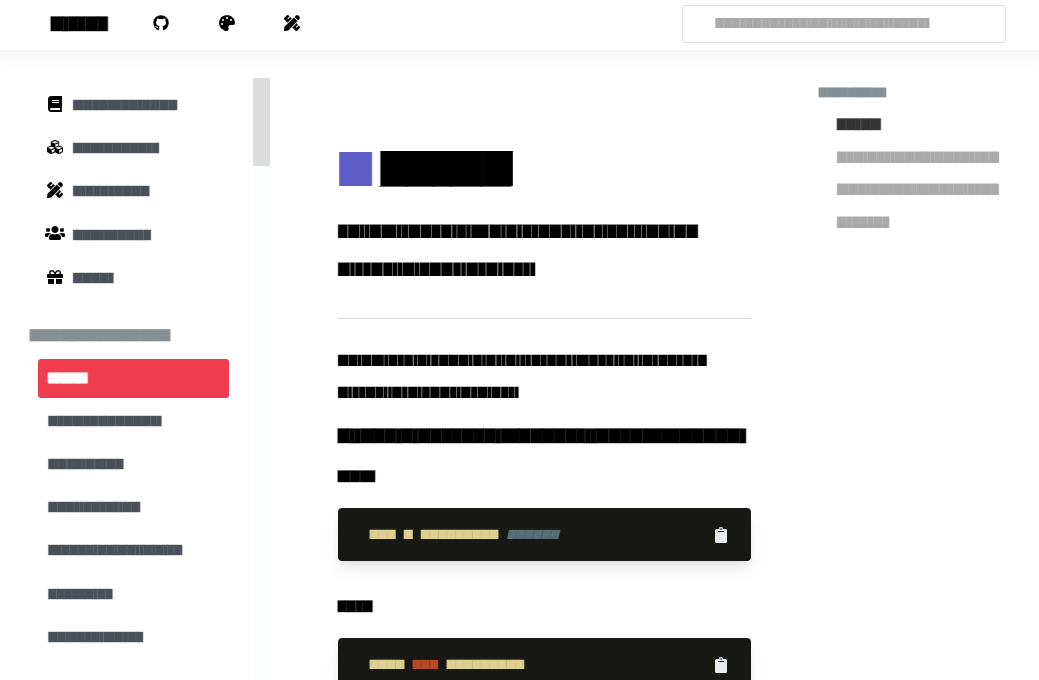
The example below is constructed using an avatar, tabs, and tiles.

John Doe

Former youngest person on Earth

Twitter

@johndoe

Instagram

@johndoe

Email

johndoe@github.com

Location

Toronto, Ontario

<div class="frame" style="height: 30rem;">
    <div class="frame__header">
        <div class="avatar"><img src="https://i.imgur.com/sbKJVxr.png"/></div>
        <p class="u-text-center frame__title">John Doe</p>
        <p class="u-text-center frame__subtitle">Former youngest person on Earth</p>
        <div class="tab-container tabs-fill">
            <ul>
                <li class="tab-item"><a>Favorites</a></li>
                <li class="tab-item selected"><a>Profile</a></li>
                <li class="tab-item"><a>Pins</a></li>
            </ul>
        </div>
    </div>
    <div class="frame__body">
        <div class="tile level p-1">
            <div class="tile-avatar"><span class="icon"><i class="fa fa-wrapper fa-twitter" aria-hidden="true"></i></span></div>
            <div class="tile__container">
                <p class="tile__title">Twitter</p>
                <p class="tile__subtitle">@johndoe</p>
            </div>
            <div class="tile__buttons"><a href="!#" class="link-btn"><span class="icon"><i class="fa fa-wrapper fa-pencil small" aria-hidden="true"></i></span></a></div>
        </div>
        <div class="tile level p-1">
            <div class="tile-avatar"><span class="icon"><i class="fa fa-wrapper fa-instagram" aria-hidden="true"></i></span></div>
            <div class="tile__container">
                <p class="tile__title">Instagram</p>
                <p class="tile__subtitle">@johndoe</p>
            </div>
        </div>
        <div class="tile level p-1">
            <div class="tile-avatar"><span class="icon"><i class="fa fa-wrapper fa-envelope-o" aria-hidden="true"></i></span></div>
            <div class="tile__container">
                <p class="tile__title">Email</p>
                <p class="tile__subtitle">johndoe@github.com</p>
            </div>
        </div>
        <div class="tile level p-1">
            <div class="tile-avatar"><span class="icon"><i class="fa fa-wrapper fa-map-marker" aria-hidden="true"></i></span></div>
            <div class="tile__container">
                <p class="tile__title">Location</p>
                <p class="tile__subtitle">Toronto, Ontario</p>
            </div>
        </div>
    </div>
    <div class="frame__footer"></div>
</div>
#2. Faster Iteration with Utilities

Starting with a full suite of prebuilt components doesn't mean sacrificing control over your design. Cirrus comes with a variety of utility classes to make your idea a reality.

These utility classes help with:

  • Designing components in a bottom up fashion writing little to no additional CSS.
  • Sticking to a consistent design system (which you can customize yourself!).
  • Reducing overhead of class naming, organization, and structuring within your project.
  • Tweaking existing components to your liking.

SuperRepo Go Volt

In-Stock

$90

Free shipping on orders over $25.

<div class="bg-white u-round-sm u-shadow-lg u-overflow-hidden">
  <div class="u-flex">
    <div class="p-3">
      <div class="u-flex u-justify-space-between u-gap-2 u-items-center">
        <div class="u-text-left">
          <p class="m-0 lead font-bold text-black tracking-tight">SuperRepo Go Volt</p>
          <div class="tag bg-green-200 text-green-600 text-xs font-bold uppercase">In-Stock</div>
        </div>
        <p class="lead mb-0 font-bold text-black">$90</p>
      </div>
      <div class="u-flex u-gap-1 mt-2">
        <a href="#" class="size bg-gray-100 text-gray-800 text-xs u-round-sm font-bold u-flex u-items-center u-justify-center" style="height: 2rem; width: 2rem;">7</a>
        <a href="#" class="size bg-gray-100 text-gray-800 text-xs u-round-sm font-bold u-flex u-items-center u-justify-center" style="height: 2rem; width: 2rem;">8</a>
        <a href="#" class="size bg-gray-100 text-gray-800 text-xs u-round-sm font-bold u-flex u-items-center u-justify-center" style="height: 2rem; width: 2rem;">9</a>
        <a href="#" class="size bg-gray-100 text-gray-800 text-xs u-round-sm font-bold u-flex u-items-center u-justify-center" style="height: 2rem; width: 2rem;">10</a>
        <a href="#" class="size bg-black text-white text-xs u-round-sm font-bold u-flex u-items-center u-justify-center" style="height: 2rem; width: 2rem;">11</a>
        <a href="#" class="size bg-gray-100 text-gray-800 text-xs u-round-sm font-bold u-flex u-items-center u-justify-center" style="height: 2rem; width: 2rem;">12</a>
      </div>
      <div class="divider"></div>
      <div class="u-flex u-gap-1">
        <button class="btn-black btn--sm mb-0 u-shadow-sm">Buy Now</button>
        <button class="bg-white btn--sm mb-0">Add to Cart</button>
        <button class="bg-white btn--sm mb-0"></button>
      </div>
      <p class="mb-0 mt-2 text-sm tracking-tight text-gray-600">Free shipping on orders over $25.</p>
    </div>
    <div>
      <img class="h-100p img-cover" src="https://images.unsplash.com/photo-1606107557195-0e29a4b5b4aa?ixlib=rb-1.2.1&amp;ixid=MnwxMjA3fDB8MHxwaG90by1wYWdlfHx8fGVufDB8fHx8&amp;auto=format&amp;fit=crop&amp;w=200&amp;q=80">
    </div>
  </div>
</div>
#3. Lightweight

Cirrus comes with lots of functionality in a small package which only consists of a single minified CSS file. No extra JS libraries required. Coming in at 20.6 KB with Brotli compression, page loads are fast and data usage is minimal.

FrameworkMinifiedGzipBrotli
Semantic UI628.5kb102.3kb79.6kb
Tailwind2927.5kb297.4kb74.3kb
Foundation182.0kb38.5kb32.1kb
Bulma206.6kb27.5kb26.9kb
Bootstrap155.6kb23kb22.4kb
Cirrus198kb30.4kb20.6kb
#4. Sass First

Cirrus is written in Sass, meaning you can leverage the power of Sass right inside your project out of the box. Importing Cirrus into your project is quite simple.

Once imported, you can use Cirrus's mixins, variables, and functions right in your project.

// main.scss
@use "cirrus-ui/cirrus-core" as *; // Core build OR
@use "cirrus-ui/src/cirrus-ext" as *; // Extended build

@screen-above($md) {
    .my-class {
        background-color: rgba(#{hex-to-rgb(fill('blue', '600'))}, .25);
    }
}
#5. Customize it for You

Cirrus is a framework that is designed to be customized. At its core is a powerful config object that dictates which classes should be generated. This mechanism makes it easy to...

...add additional styles.

// main.scss
@use "cirrus-ui/src/cirrus-ext" as * with (
    $config: (
        extend: (
            opacity: (
                25: .25,
                75: .75,
            ),
            round: (
                50: 50%,
            ),
        ),
    )
)

...turn off features.

// main.scss
@use "cirrus-ui/src/cirrus-ext" as * with (
    $config: (
        excludes: (
            AVATAR,
            MODAL,
            PAGINATION,

            CLEARFIX,
            OPACITY,
        )
    )
)

...toggle viewport variants for classes.

// main.scss
@use "cirrus-ui/src/cirrus-ext" as * with (
    $config: (
        viewports: (
            FLOAT: false,
            GAP: true,
        )
    )
)

...overwrite defaults.

// main.scss
// Note that I am not using the extend keyword
@use "cirrus-ui/src/cirrus-ext" as * with (
    $config: (
        letter-spacing: (
            tightest: -.3rem,
            tighter: -.2rem,
            tight: -.1rem,
        )
    )
)

And a lot more.

Find out how in the developing section.